[ADVERTISEMENT – THIS POST IS IN COLLABORATION WITH Nordfärg, BUT ALL WORDS AND OPINIONS ARE MY OWN.]
To make a house feel like a home takes time, and what I’ve learned is that you never really finish. It’s more a matter of continuous tweaks, radical refreshes, and moments of motivation.
Next year my husband and I will have lived in our home for ten years. Not only does this make me feel extremely old, but it’s also made me realise just how much we’ve achieved.
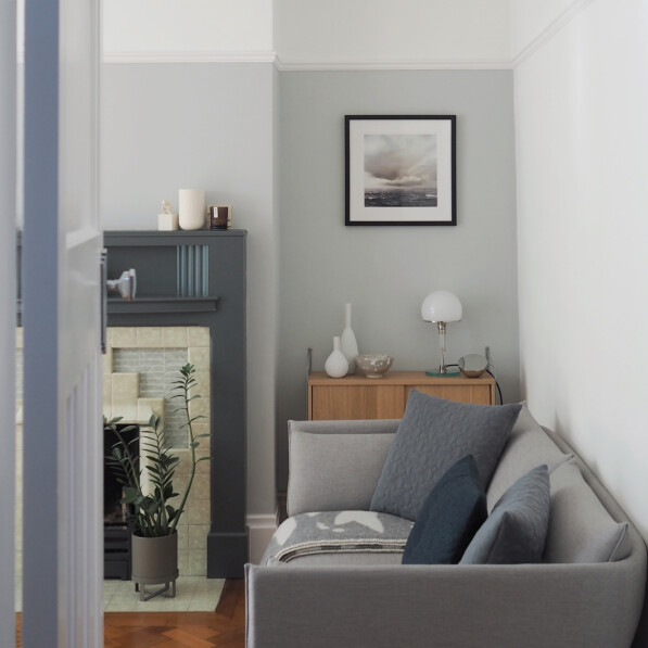
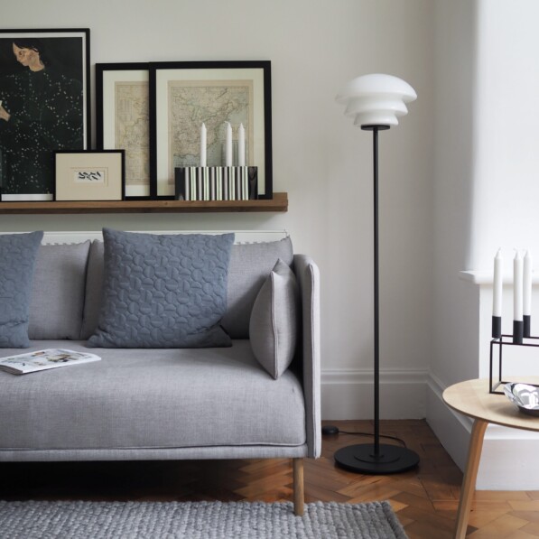
That’s why it felt right to team up with paint company Nordfärg again and share the interior we’ve created. By using a palette of paired back colours, natural materials and contrasting details we’ve made our 1930s semi feel like our own.
Offering thirty beautiful colours, in both the ‘VÄGG’ matt wall paint and the ‘TRÄ’ wood paint, Nordfärg take inspiration from the architecture, landscape and light conditions found across the Nordic region.
If that wasn’t enough, all Nordfärg paint is produced in small batches using 100% green energy. By combining Sweden’s renewable power and Iceland’s geothermal heat, they have earned themselves a coveted Nordic Swan and EU Ecolabel, the highest sustainability accolades awarded, as well as been given the Seal of Approval by Allergy UK. They are the only UK paint company to have gained this.
Easy to apply and drying to soft velvety finish, I’ve been using Nordfärg paints for a while now and find the coverage fantastic. What’s more they are also washable and durable coping well with the constant demands of family life.
So with Nordfärg’s help, I wanted to take a closer look at three rooms in my home and create a Nordic mood board for each.
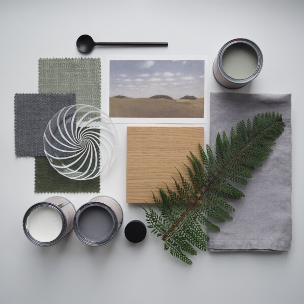
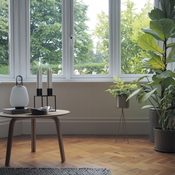
Muted greens in the living room
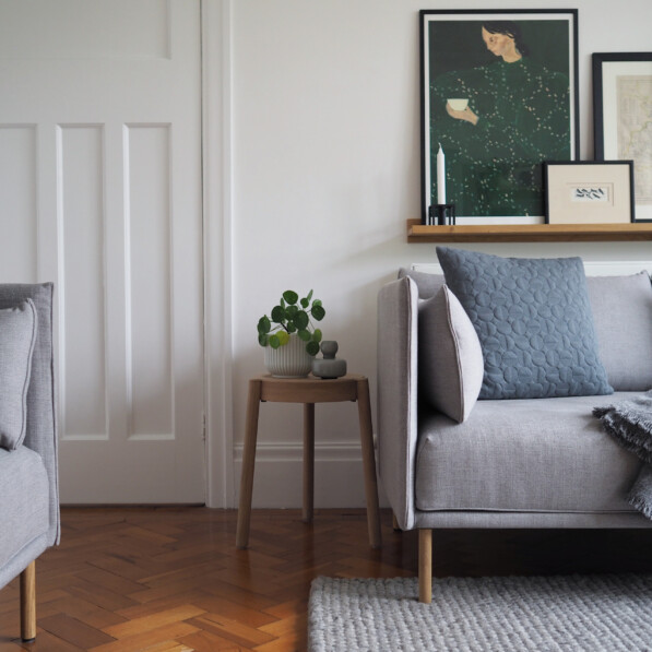
With its large bay window looking out on our front garden and view beyond, our living room has become a soothing space of greens and greys. Referencing the leaves and fronds found outside, these muted shades of ‘Mossa’ and ‘Lera’ make the perfect pairing to our contemporary grey walls, fireplace, and sofas.
Warm yellows in the bedroom
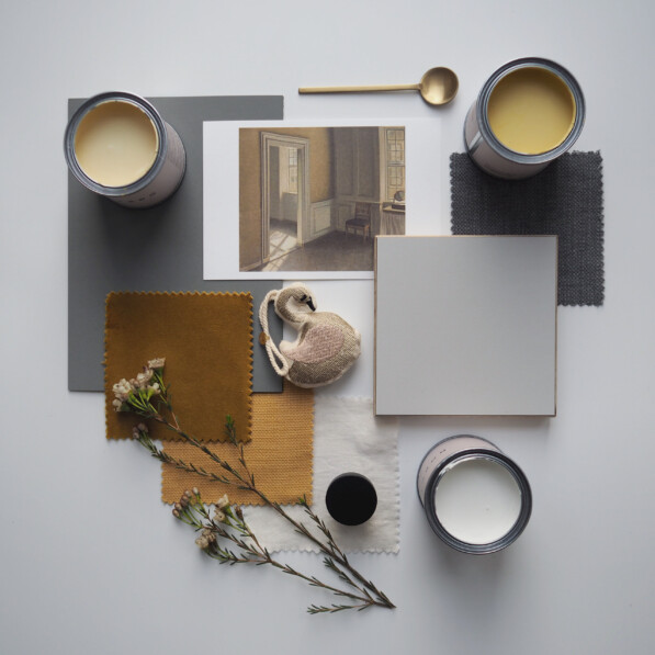
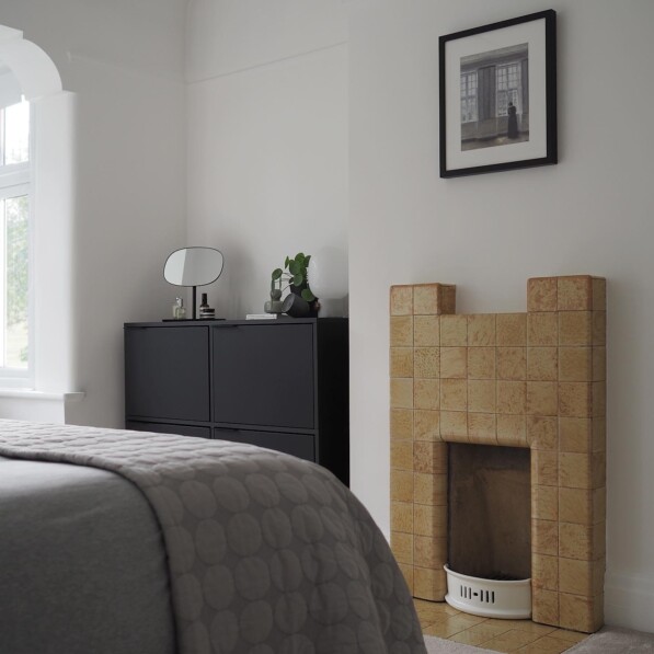
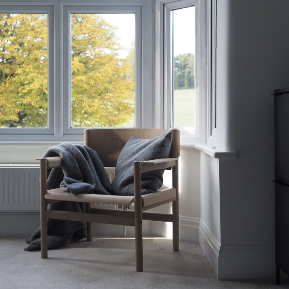
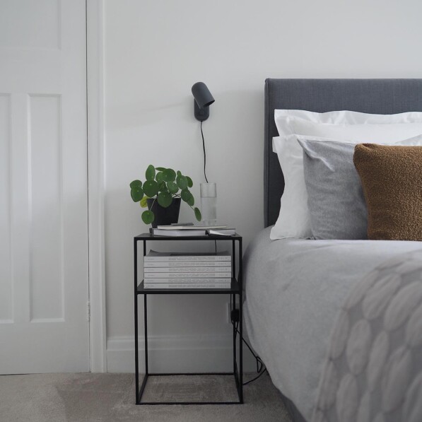
Even though I prefer a more understated look I’ve grown to love the striking ochre coloured fireplace in our bedroom. Working with it rather than against it, the warm tones of ‘Balthus’ and ‘Hägring’ enliven and elevate the natural woods, grey bed linen and white walls and once we get to autumn and the leaves on the trees outside turn golden the whole room sings.
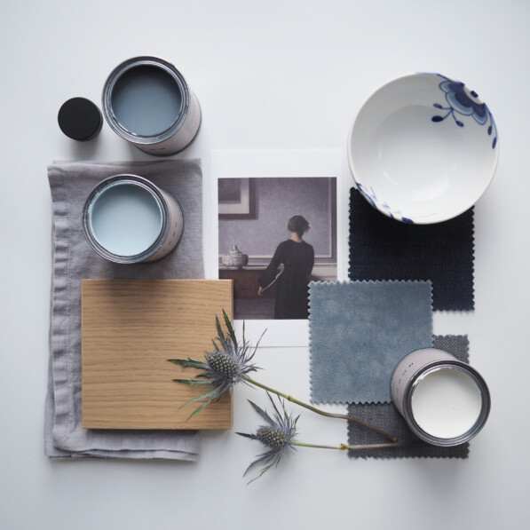
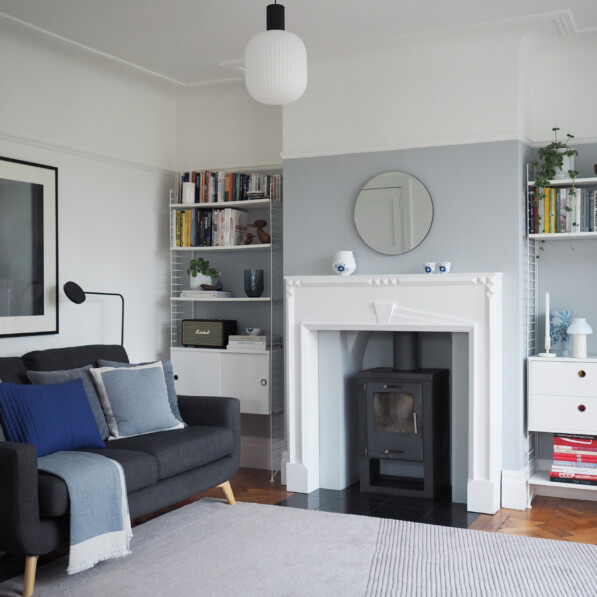
Moody blues in the family room and dining area
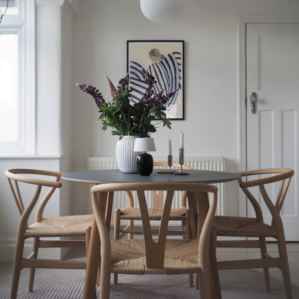
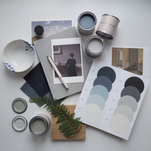
Like many houses of this age the back half of our ground floor is open plan. Given how much natural light flows into this combined family room, dining space and kitchen, the neutral décor and natural materials we love are heightened by the moody shades of ‘Skogsbär’ and ‘Blå Dörr’ taking their cues from the changing sky, as well as my growing Royal Copenhagen collection of course.
I hope my home and mood board inspiration will help you find a Nordic interior style that’s right for you.
To find out more about Nordfärg and to order your free colour card, visit their website.
Nordfärg kindly gifted paint products in return for this post.
Enjoyed this post? Then why not get even more inspiration from Farrow & Ball’s Nordic Edit collection.
All photography by Nicola Capper.



Leave a Reply